ローレンツアトラクター蝶のような図【Python×matplotlib×ChatGPT】
こんにちは!
今回は「ローレンツ蝶」とも呼ばれる、ローレンツアトラクターをpythonで描いてみました。
カオス理論については、よくわからないのですが奇妙で複雑な図に興味を持ちました。

言われてみれば確かに、蝶に見えますね。
pythonコードです。
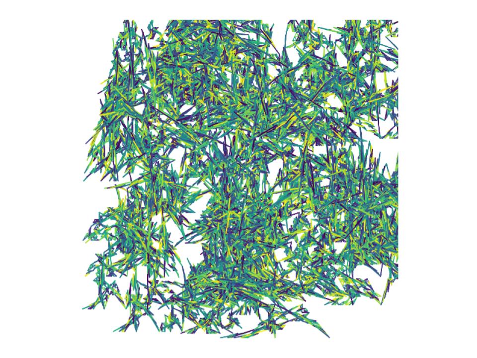
import numpy as np
import matplotlib.pyplot as plt
from mpl_toolkits.mplot3d import Axes3D

def lorenz_equations(x, y, z, sigma, rho, beta):
    dx_dt = sigma * (y - x)
    dy_dt = x * (rho - z) - y
    dz_dt = x * y - beta * z
    return dx_dt, dy_dt, dz_dt

def simulate_lorenz_system(sigma, rho, beta, x0, y0, z0, num_steps, dt):
    x, y, z = np.zeros(num_steps), np.zeros(num_steps), np.zeros(num_steps)
    x[0], y[0], z[0] = x0, y0, z0

    for i in range(1, num_steps):
        dx, dy, dz = lorenz_equations(x[i-1], y[i-1], z[i-1], sigma, rho, beta)
        x[i] = x[i-1] + dt * dx
        y[i] = y[i-1] + dt * dy
        z[i] = z[i-1] + dt * dz

    return x, y, z

def plot_recursive_lorenz(num_recursive, ax, sigma, rho, beta, x0, y0, z0, num_steps, dt):
    if num_recursive == 0:
        return

    x, y, z = simulate_lorenz_system(sigma, rho, beta, x0, y0, z0, num_steps, dt)
    line_widths = np.random.rand(num_steps) * 2.0 + 0.5

    ax.plot(x, y, z, linewidth=0.5, alpha=0.7)

    new_x0, new_y0, new_z0 = x[-1], y[-1], z[-1]
    plot_recursive_lorenz(num_recursive-1, ax, sigma, rho, beta, new_x0, new_y0, new_z0, num_steps, dt)

# パラメータ設定
sigma = 10.0
rho = 28.0
beta = 8/3
x0, y0, z0 = 0.1, 0.1, 0.1
num_steps = 10000
dt = 0.01
num_recursive = 10

# 3Dプロット
fig = plt.figure(figsize=(10, 8))
ax = fig.add_subplot(111, projection='3d')

# 再帰的にプロット
plot_recursive_lorenz(num_recursive, ax, sigma, rho, beta, x0, y0, z0, num_steps, dt)

ax.set_xlabel('X')
ax.set_ylabel('Y')
ax.set_zlabel('Z')
ax.set_title('Recursive Lorenz Attractor')

# 軸を消して図だけを表示
ax.set_axis_off()

plt.show()
少々、アレンジした図がこちらです。
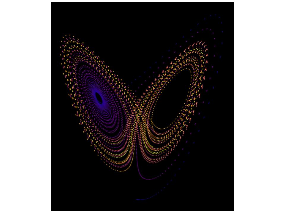
より蝶に見えるかもしれません。
不思議です。
【Python×matplotlib×ChatGPT】ロマネスコ・ブロッコリーのようなフラクタルな図
こんにちは!
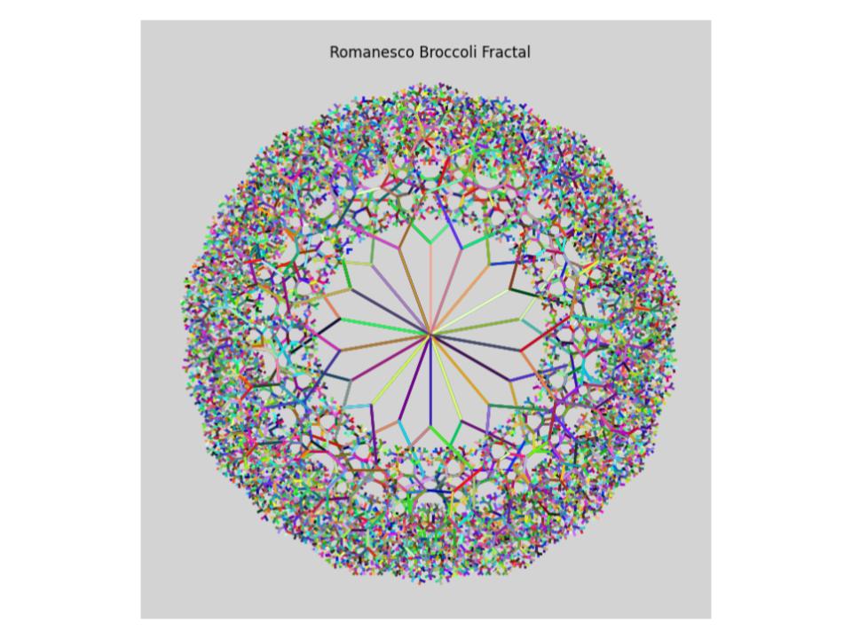
今回はロマネスコ・ブロッコーリーをpythonで描画してみます。
ロマネスコ・ブロッコリーとは・・・カリフラワーの一種みたいです。
私は実際に見たことも食べたこともありません。
図にすると、ブロッコリーみたいになるのかなと思い、面白そうなので試してみました。
ChatGPTとあれやこれやしていると、2通りの図ができました。
まずは、なんとなくブロッコリーに見える図1です。
pythonコードです
import matplotlib.pyplot as plt
import numpy as np
import random
from matplotlib.colors import LinearSegmentedColormap

def draw_fractal(levels, size, base_angles):
    def draw_branch(x, y, angle, length, depth):
        if depth == 0:
            return
        x2 = x + length * np.cos(np.radians(angle))
        y2 = y + length * np.sin(np.radians(angle))
        cmap = generate_random_cmap()
        plt.plot([x, x2], [y, y2], color=cmap(random.random()), lw=2)
        draw_branch(x2, y2, angle - 45, length / 1.5, depth - 1)
        draw_branch(x2, y2, angle + 45, length / 1.5, depth - 1)

    # プロット領域の設定
    plt.figure(figsize=(8, 8), facecolor='lightgray')  # 背景色の変更
    plt.axes().set_aspect('equal', 'datalim')

    # 各レベルごとにフラクタルな形状を描画
    for level in range(1, levels + 1):
        angle_shift = 0 if level % 2 == 0 else 180 / len(base_angles)
        angles = base_angles + angle_shift
        for angle in angles:
            x, y = 0, 0
            draw_branch(x, y, angle, size, level)

    plt.axis('off')
    plt.title('Romanesco Broccoli Fractal')  # グラフタイトルの追加
    plt.show()

def generate_random_cmap():
    colors = [(random.random(), random.random(), random.random()) for _ in range(100)]
    cmap_name = f'random_cmap_{random.randint(0, 10000)}'
    return LinearSegmentedColormap.from_list(cmap_name, colors, N=100)

if __name__ == "__main__":
    # ロマネスコ・ブロッコリーの描画パラメータ
    levels = 10      # レベル数
    size = 100       # 描画領域のサイズ
    base_angles = np.array([30, 70, 110, 150, 190, 230, 270, 310, 350])

    draw_fractal(levels, size, base_angles)
なんとなくブロッコリーに見える図2です。

次にブロッコリーの芯?に見える図1です。
等高線みたいです。

ブロッコリーの芯?に見える図2です。

楽しめたのでブロッコリーはこれで終わりにします。
【Python×matplotlib×ChatGPT】稲妻(雷)を描きたい
今日も、こんにちは!
前回は、ChatGPTと稲妻を描こうとしたらこんな感じになってしまいました。

全然稲妻ではありません・・・
今回は稲妻の形を少しでも出したい、ということで以下のサイトを参考にさせていただきました。
emotionexplorer.blog.fc2.com
出来上がったコード
import numpy as np
import matplotlib.pyplot as plt

class DLA:
    def __init__(self, N, view=True, color=True, sharpness=2):
        self.r = 3
        self.N = N
        self.view = view
        self.color = color
        self.sharpness = sharpness
        self.L = int(self.N ** (0.78 + 0.22 * self.sharpness))

        # Update the lattice size to be 5 times larger
        self.lattice = np.zeros([14*self.L+1, 14*self.L+1], dtype=int)
        self.center = 7* self.L
        self.lattice[self.center, self.center] = 1

    def grow_cluster(self):
        rn = np.random.rand

        def reset():
            theta = 2 * np.pi * rn()
            x = int((self.r + 2) * np.cos(theta)) + self.center
            y = int((self.r + 2) * np.sin(theta)) + self.center
            return x, y

        x, y = reset()

        n = 0
        while n < self.N:
            r = np.sqrt((x - self.center) ** 2 + (y - self.center) ** 2)
            if r > self.r + 2:
                l = int(r - self.r - 2)
                if l == 0:
                    l = 1
            else:
                l = 1

            p = rn() * 4
            if p < 1:
                x += l
            elif p < 2:
                x -= l
            elif p < 3:
                y += l
            else:
                y -= l

            r = np.sqrt((x - self.center) ** 2 + (y - self.center) ** 2)

            if r >= 2 * self.r:
                x, y = reset()
                continue

            judge = np.sum(self.lattice[x-1:x+2, y-1:y+2])

            if judge > 0:
                self.lattice[x, y] = 1

                if self.view:
                    if self.color:
                        color = (1, 1, 0)  # カラーを黄色に設定 (RGBでの値は(1, 1, 0))
                    else:
                        color = 'white'
                    size = rn() * 20 + 5  # ランダムな大きさ (5から25までの間)
                    plt.scatter(x - 5*self.L, y - 5*self.L, color=color, s=size)

                if int(r) + 1 > self.r:
                    self.r = int(r) + 1

                x, y = reset()
                n += 1

        if self.view:
            plt.gca().set_facecolor('black')  # 背景を黒に設定
            plt.gca().set_aspect('equal', adjustable='box')
            plt.gca().set_xticks([])
            plt.gca().set_yticks([])
            plt.show()

def main():
    dla = DLA(1000, view=True, color=True, sharpness=1)
    dla.grow_cluster()

if __name__ == '__main__':
    main()
出来上がった図
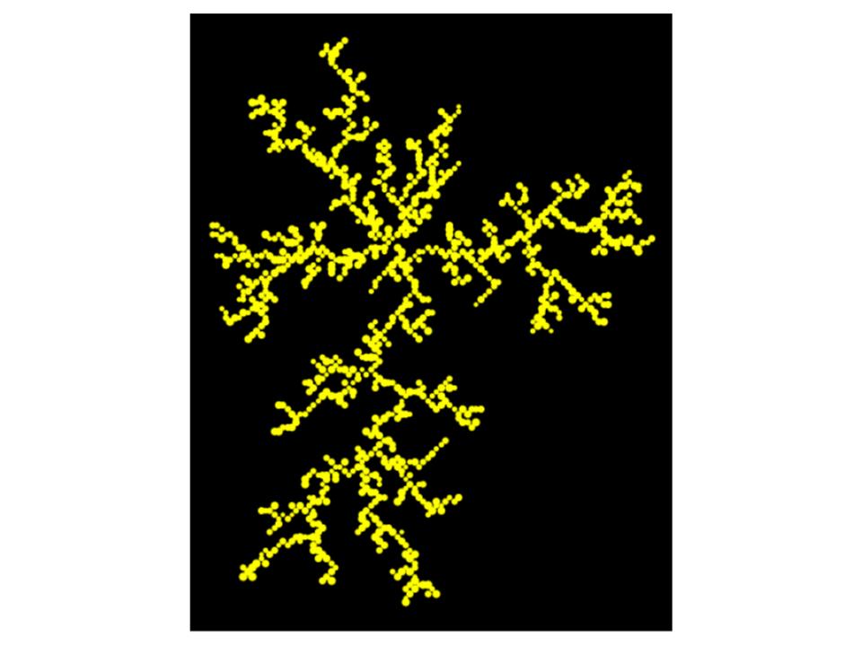
稲妻に見えます。
次は、色を変えてみました。
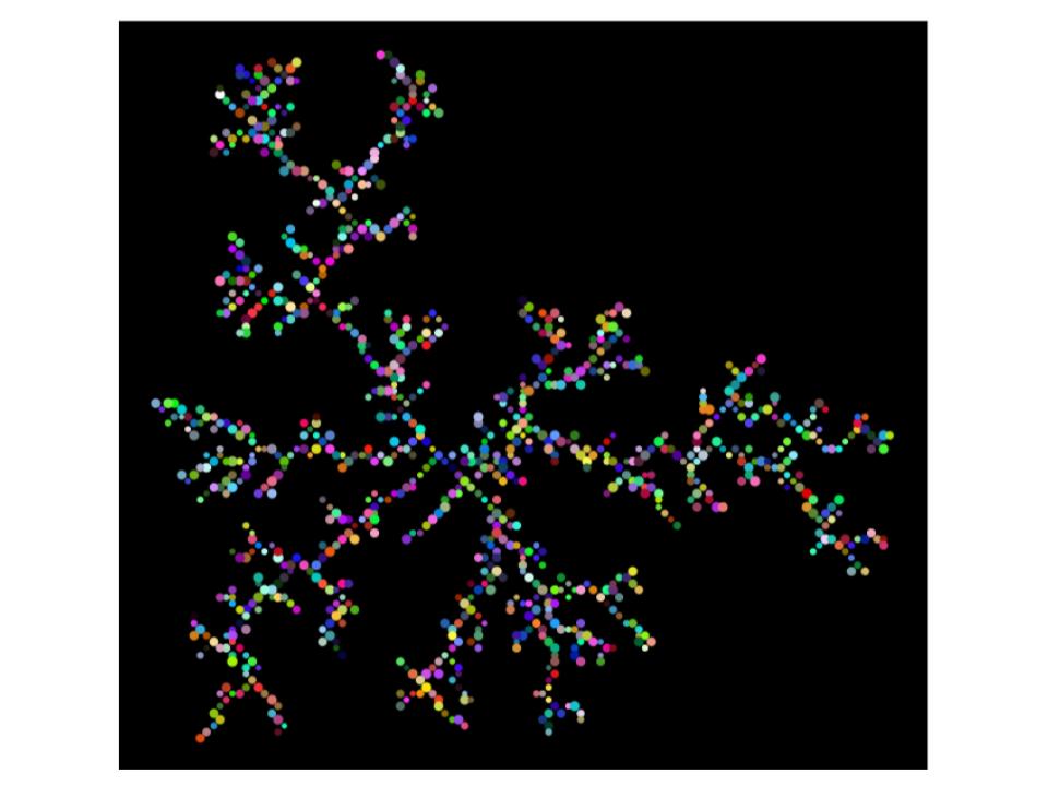
よくわからない図になりましたね。
でも、それなりにできたので満足です。
【Python×matplotlib×ChatGPT】稲妻(雷)を描くつもりが・・・
はい!こんにちは!
今回もプログラミングで何かを描画していきたいと思います。
ぱっと思い浮かんだのが、稲妻。
どう描画するのか検討もつかないので、ChatGPTにコードをお願いしてみました。
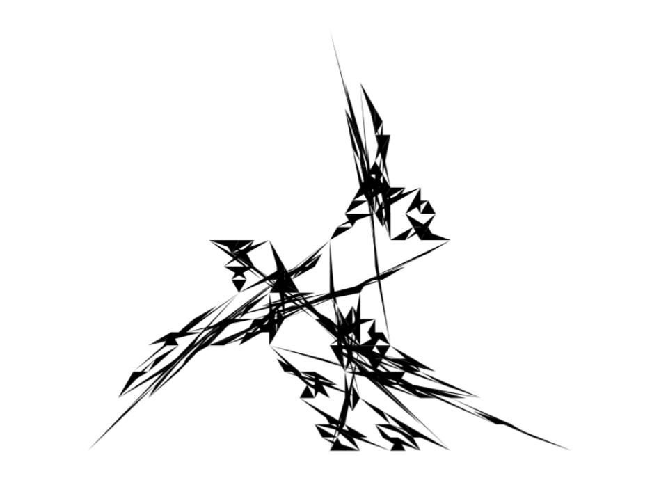
すると、こんな図ができました。
いやちがう、
そもそもグラフいらない、
アートにしてとお願いすると・・・

だめだ・・・
なんかよくわかりませんが、稲妻とかけ離れました・・・
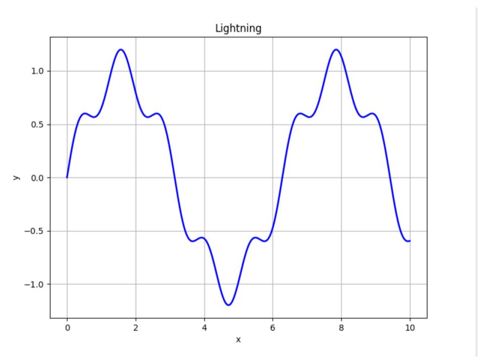
以下、pythonコードです。
import numpy as np
import matplotlib.pyplot as plt

def draw_artistic_lightning():
    # 稲妻の曲線を表すデータを作成
    x = np.linspace(0, 10, 1000)
    y = np.sin(x) + 0.2 * np.sin(5 * x)

    # 描画領域を作成
    fig, ax = plt.subplots(figsize=(8, 6))

    # 背景色を黒に設定
    fig.patch.set_facecolor('black')

    # 稲妻の曲線を描画
    ax.plot(x, y, color='red', linewidth=2)
    ax.plot(x, -y, color='orange', linewidth=2)
    ax.plot(x, y + 2, color='yellow', linewidth=2)
    ax.plot(x, -y + 2, color='green', linewidth=2)
    ax.plot(x, y + 4, color='blue', linewidth=2)
    ax.plot(x, -y + 4, color='purple', linewidth=2)

    # 軸と枠線を非表示に設定
    ax.axis('off')

    # 描画を表示
    plt.show()

# アートにした稲妻を描画
draw_artistic_lightning()
こうなったら、何らかの図にしたいと思い
どうにかアレンジして何かの図にして、とお願いすると
あら?なんか好きな図になりました。
星を散りばめてくれて、なんとなく可愛い感じになりました。
今回はこれで満足しました。
次回は、稲妻っぽく描画することにチャレンジしてみようと思います。
【Python×matplotlib×ChatGPT】シェルピンスキーのギャスケットとカーペットをアレンジ!鋭利な三角形になりました。
こんにちは!みなさん。
今日もpythonでプログラミングをして自分好みの図形を作っていていきます。
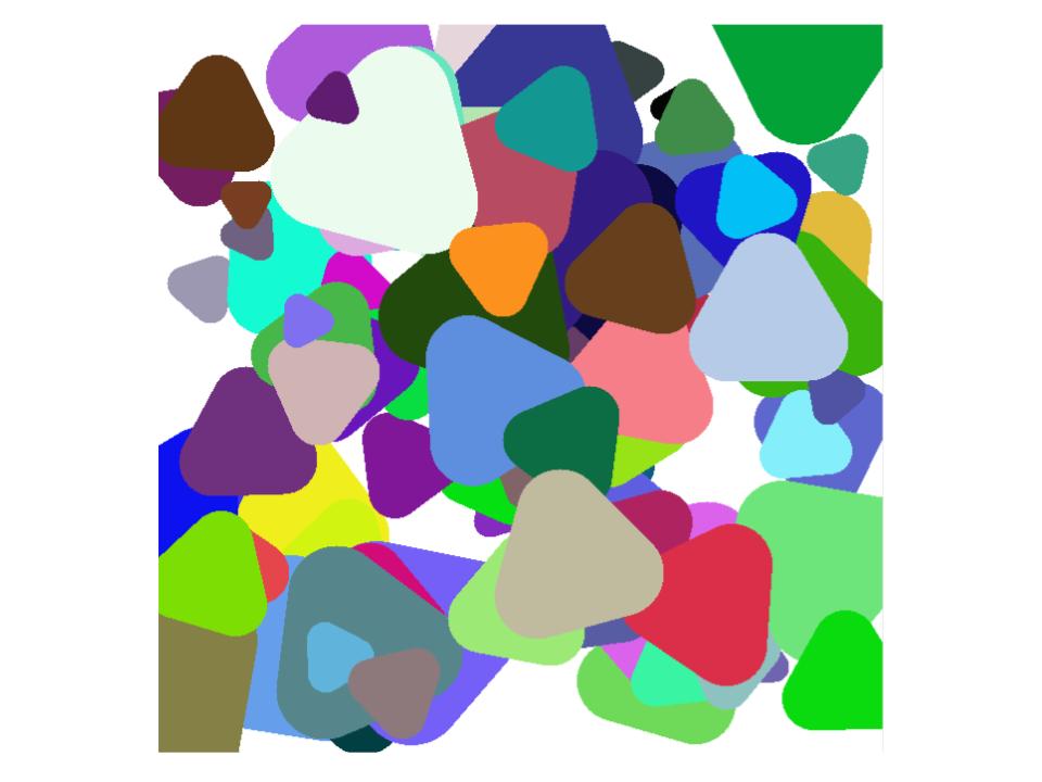
これまで作った図の中で、お気に入りの3つです。
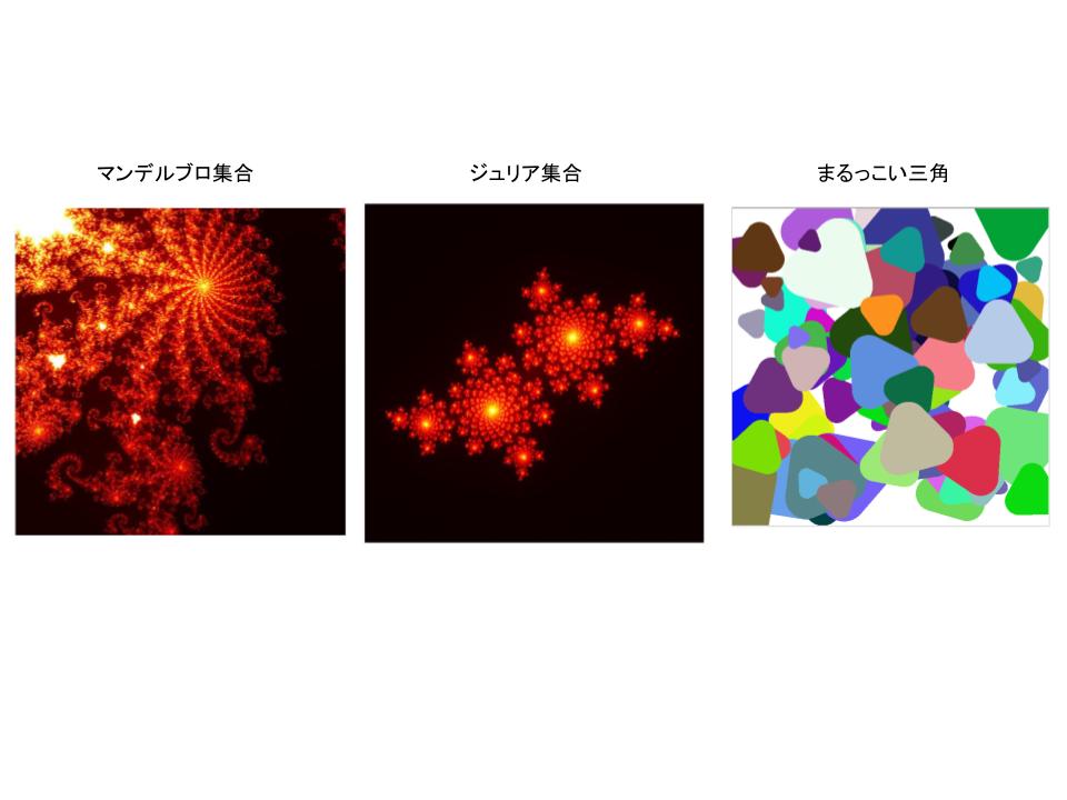
好きな図を見ていると、なんだか落ち着いた気持ちになります。
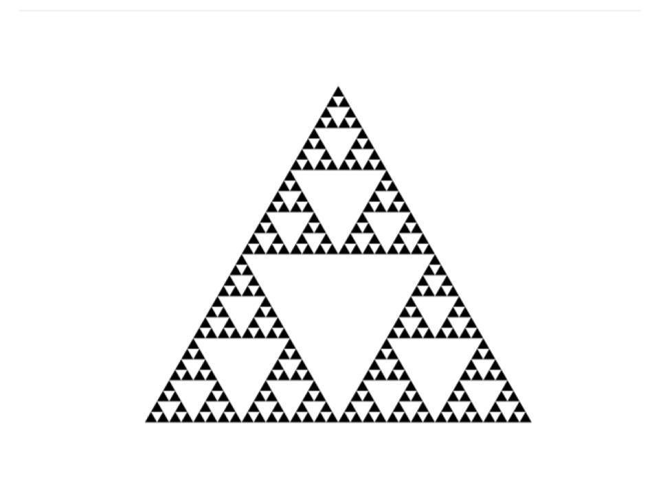
こんな感じで、もっと何か作りたいなと幾何学模様をキーワードに探していると、シェルピンスキーのギャスケットという図が目に止まりました。
こういう図です。
pythonコードです。
import matplotlib.pyplot as plt

def draw_sierpinski_triangle(ax, x1, y1, x2, y2, x3, y3, depth):
    if depth == 0:
        ax.fill([x1, x2, x3], [y1, y2, y3], 'k')
        return

    # Calculate midpoints of the edges
    mid_x1, mid_y1 = (x1 + x2) / 2, (y1 + y2) / 2
    mid_x2, mid_y2 = (x2 + x3) / 2, (y2 + y3) / 2
    mid_x3, mid_y3 = (x1 + x3) / 2, (y1 + y3) / 2

    draw_sierpinski_triangle(ax, x1, y1, mid_x1, mid_y1, mid_x3, mid_y3, depth - 1)
    draw_sierpinski_triangle(ax, mid_x1, mid_y1, x2, y2, mid_x2, mid_y2, depth - 1)
    draw_sierpinski_triangle(ax, mid_x3, mid_y3, mid_x2, mid_y2, x3, y3, depth - 1)

# Set up the plot
fig, ax = plt.subplots()
ax.set_aspect('equal')
ax.axis('off')

# Define the initial triangle
x1, y1 = 0, 0
x2, y2 = 1, 0
x3, y3 = 0.5, 0.87  # Height of an equilateral triangle

# Number of iterations (increase this for more detail)
depth = 5

draw_sierpinski_triangle(ax, x1, y1, x2, y2, x3, y3, depth)

plt.show()
三角形が規則正しく並んでいます。
見れば見るほど、なぜか怖い感じがします。
三角形の頂点をランダムにすると、下のような図ができました。
個人的に好きな図です。
シャープな感じがかっこよいなと思いました。
三角形の数を増やして、色を付けると以下のような感じになりました。
笹の葉に見えます。
これもいいですね。
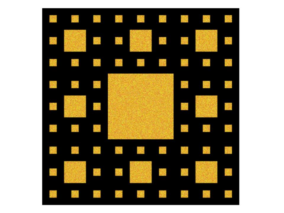
次に、シェルピンスキーのカーペットです。
四角なんですね。こんな感じです。色を付けてみました。
pythonコードはこちらです。
import numpy as np
import matplotlib.pyplot as plt

def generate_random_warm_color():
    # Generate a random warm color (e.g., shades of red, orange, and yellow)
    r = np.random.randint(200, 256)
    g = np.random.randint(100, 256)
    b = np.random.randint(0, 100)
    return (r, g, b)

def draw_carpet(image, x, y, size, depth):
    if depth <= 0:
        return

    # Draw the central square
    center_x = x + size // 3
    center_y = y + size // 3
    center_size = size // 3

    # Add texture to the central square
    texture_size = center_size // 2
    texture = np.zeros((texture_size, texture_size, 3), dtype=np.uint8)
    for i in range(texture_size):
        for j in range(texture_size):
            texture[i, j] = generate_random_warm_color()

    # Ensure texture fits within the central square
    if texture.shape != (center_size, center_size, 3):
        texture = np.zeros((center_size, center_size, 3), dtype=np.uint8)
        for i in range(center_size):
            for j in range(center_size):
                texture[i, j] = generate_random_warm_color()

    image[center_y:center_y + center_size, center_x:center_x + center_size] = texture

    # Recursive calls for the eight smaller squares
    new_size = size // 3
    for dx in range(3):
        for dy in range(3):
            if dx == 1 and dy == 1:
                continue
            new_x = x + dx * new_size
            new_y = y + dy * new_size
            draw_carpet(image, new_x, new_y, new_size, depth - 1)

def main():
    size = 729
    depth = 3  # Set the depth of recursion (adjust as needed)

    # Create a blank white image
    image = np.zeros((size, size, 3), dtype=np.uint8)

    # Draw the carpet
    draw_carpet(image, 0, 0, size, depth)

    # Display the image using matplotlib
    plt.imshow(image)
    plt.axis('off')
    plt.show()

if __name__ == "__main__":
    main()
そして、立体的に見えるようにしてみました。
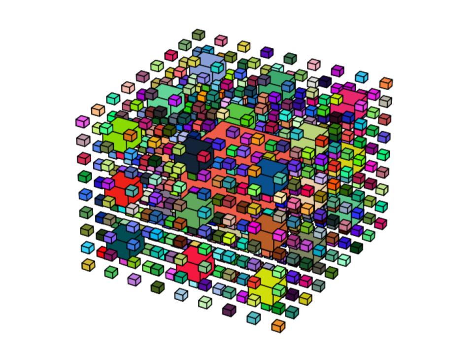
四角がいっぱいですね。
なかなか可愛いです。
ジュリア集合の可視化を試みる【Python×matplotlib×ChatGPT】
今日もこんにちは!
前回は、マンデルブロ集合を可視化してみました。
こんな図です。
今回は、ジュリア集合を可視化してみようと思います。
ジュリア集合とはなんなのか・・・
よくわかりません。
ChatGPTによると、
ジュリア集合は、複素数の数列を生成する再帰的な関数を用いて描かれる数学的な図形です。ジュリア集合はフラクタルとして知られており、美しい幾何学的な模様を生成しますジュリア集合の特徴は、その形状が収束する点(収束バスケット)や複雑なフラクタル構造を持つ点などがあります。さらに、ジュリア集合は数学的にも興味深く、カオス理論や非線形ダイナミクスの研究にも関連しています。
ということです。
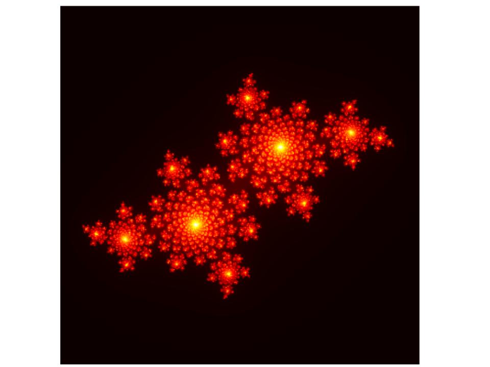
そして、ChatGPTが作り出したジュリア集合がこちらです。

以下は、pythonコードです。
import numpy as np
import matplotlib.pyplot as plt

def julia_set(width, height, x_min, x_max, y_min, y_max, c, max_iter):
    x = np.linspace(x_min, x_max, width)
    y = np.linspace(y_min, y_max, height)
    X, Y = np.meshgrid(x, y)
    Z = X + 1j * Y
    img = np.zeros(Z.shape, dtype=int)

    for i in range(max_iter):
        mask = np.abs(Z) < 1000
        Z[mask] = Z[mask] ** 2 + c
        img += mask

    return img

# パラメータ設定
width, height = 800, 800
x_min, x_max = -2, 2
y_min, y_max = -2, 2
c = -0.8 + 0.156j
max_iter = 256

# ジュリア集合の計算
img = julia_set(width, height, x_min, x_max, y_min, y_max, c, max_iter)

# 描画
plt.imshow(img, extent=(x_min, x_max, y_min, y_max), cmap='hot')
plt.axis('off')  # 軸の表示をオフにする
plt.savefig('julia_set.png', bbox_inches='tight', pad_inches=0)
plt.show()
パラメータ設定を変更すると、また面白い図が出てきます。
# パラメータ設定
width, height = 800, 800
x_min, x_max = -1.6, 1.6
y_min, y_max = -1.6, 1.6
c = -0.4 + 0.6j
max_iter = 256
# パラメータ設定
width, height = 800, 800
x_min, x_max = -2, 2
y_min, y_max = -2, 2
c = -0.7269 + 0.1889j
max_iter = 512
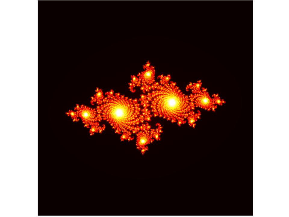
面白くて、楽しい形です。
これらジュリア集合の図形の集合として表現されるのがマンデルブロ集合なのだそうです。
確かに、最初に載せたマンデルブロ集合の図をみてみると、ジュリア集合の図が集まっているように思えます。
むづかしいですが、図が気に入ればそれでいいです。
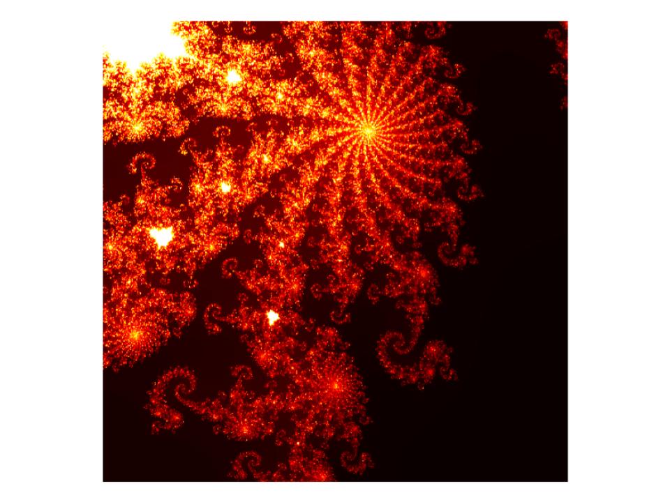
美しいのか奇妙なのか・・・マンデルブロ集合を可視化した図【Python×matplotlib×ChatGPT】
さて、こんばんわ!今回もPythonで図を描画したいと思います。
前回はまるっこい三角形や四角形を描画しました。
こんな図です。
今回は趣を変えて、マンデルブロ集合です。
マンデルブロ集合、ご存知ですか?私は知りませんでした。
なにやら数学が絡んでいて、ちゃんとした数式があるのですが、私には理解できません。
ということで割り切って、図、のみに着目します。
さて、マンデルブロ集合、こんな図です。

眩しい・・・こんな図があるのですね。
Pythonのコードはこちらです。ChatGPTから情報を得ました。
import numpy as np
import matplotlib.pyplot as plt

def mandelbrot(c, max_iter):
    z = c
    for i in range(max_iter):
        if abs(z) > 2:
            return i
        z = z * z + c
    return max_iter

def create_mandelbrot(width, height, real1, real2, imag1, imag2, max_iter):
    image = np.zeros((height, width))

    for x in range(width):
        for y in range(height):
            zx = np.interp(x, [0, width], [real1, real2])
            zy = np.interp(y, [0, height], [imag1, imag2])
            c = zx + zy * 1j
            color = mandelbrot(c, max_iter)
            image[y, x] = color

    return image

def plot_mandelbrot(image):
    plt.figure(figsize=(8, 8))
    plt.imshow(image, cmap='hot', extent=[-1.5, -1.3, -0.1, 0.1])
    plt.axis('off')
    plt.show()

def main():
    width = 512
    height = 512
    real1 = -1.5  # ズームインしたい範囲の左端の実部
    real2 = -1.3  # ズームインしたい範囲の右端の実部
    imag1 = -0.1  # ズームインしたい範囲の下端の虚部
    imag2 = 0.1   # ズームインしたい範囲の上端の虚部
    max_iter = 500

    image = create_mandelbrot(width, height, real1, real2, imag1, imag2, max_iter)
    plot_mandelbrot(image)

if __name__ == '__main__':
    main()
ここで、マンデルブロ集合の特徴を、ChatGPTに教えてもらいました。
マンデルブロ集合は非常に複雑で美しい幾何学的なパターンを持つことがあります。
可視化には、プログラミングや数値計算の手法が一般的に使用されます。
座標やズームレベルを変更することで、異なる部分を拡大したり、興味深い規則正しいパターンを見つけたりすることができます。
数学的に興味深く、美しい視覚表現が可能になります。
なるほど。
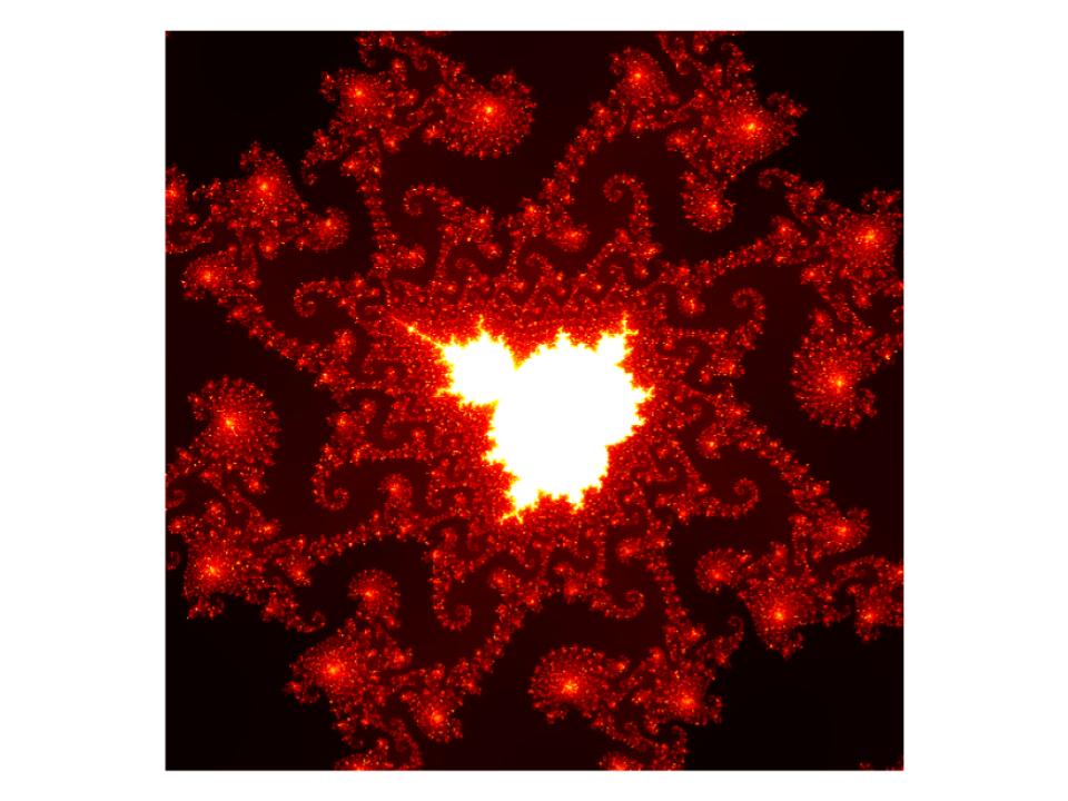
ということで、座標やズームレベルを変更してみました。
# 座標1
x_c1 = -0.743643135
y_c1 = 0.131825963
zoom1 = 0.000014628
max_iter1 = 1000
かなりダイナミックです。
# 座標2
x_c2 = -0.8
y_c2 = 0.156
zoom2 = 0.003
max_iter2 = 1000
なんかかっこいい!と個人的には思いました。
すごいです。
プログラミングでこんな図が描けるのですね。
こうやって色々ためして、自分のお気に入りの図を持つのも良さそうです。